Showing posts with label ♥ford. Show all posts

Greetings from Hartford!

We are thrilled to be rolling out our new line of Hartford-themed greeting cards!  We think these cards are fabulous (if we do say so ourselves!) and wanted to take a minute to tell you more about them.

Here is the full set of five cards:


As you can see, the cards share a general aesthetic:  more-or-less black and white with a lot of white space for awesome compositions and paired with a brightly colored envelope.  There is a range of text and image, from the text-centric Hartford Nicknames card to the line drawing of the Hartford Skyline card.  In the West End Street Map card, the text creates the image and in the Hartford Text/Image card, the images are inside the text.  We love achieving the right balance of words and drawings!


Hartford Love                                                                                                                            

Younger sister Rory is responsible for the creation of this card.  We have always loved the play on words with Hartford and Heartford, or even ford.  What better way of telling someone how special they are than this?


The text is hand-set lead type and the red heart is a paper cutout.  This gives the card layers of relief: the words pressed into the paper, the surface of the paper itself and the raised relief of the heart.  Multiple layers of art for multiple layers of love!

We've paired this card with a sunny orange envelope which complements the red heart nicely.  If you dig it (and we hope you do!) you can buy this card at our etsy site here.


Hartford Skyline                                                                                                                        
This skyline first appeared in a drawing older sister Addy did for an exhibition at the Hartford Public Library's ArtWalk.  It was then cleaned up for a rehearsal dinner invite we printed not too long ago.


We love how versatile this little drawing is!  In our card, like the invitation above, the skyline appears at the bottom of the paper, leaving a large open sky above.


Showcased are the Colt Building, the Capitol Building, City Place, the Travelers Tower, the Boat Building, the CT Science Center and the Stilts Building.  Check out the stars on the dome of the Colt Building!  An iconic image of Hartford, for sure.

This card comes with a vibrant persimmon envelope and can be purchased here.


Hartford Text/Image                                                                                                                   
This card gets its inspiration from great vintage postcards like these:
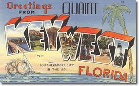


We love how images from the two locations appear inside the letters of their names.  We thought we'd do the same thing with Hartford except we would include cultural aspects as well as physical locations.


We also streamlined our design so it better matches the aesthetic of the other cards in the set.  We nixed any background images and kept the letters in a straight line.  Older sister Addy once again put her drawing skills to use to bring you (H) the Whalers, (A) the Colt Building, (R) Mark Twain's portrait, (T) the Charter Oak Tree, (F) the Boat Building, (O) the Capitol, (R) a map of Hartford's neighborhoods, (D) Alexander Calder's Stegosaurus.

Each drawing includes the name of what it is, so if you are sending this card to a friend who doesn't know the city that well, she will still know what she is looking at!  You can buy this card with it's electric green envelope here.


Hartford Nicknames                                                                                                                    
Ah, the blind emboss.  One of our favorite techniques for its subtle effect and because we don't have to ink up the press!  Here we rely solely on the hand-set lead type being impressed into the paper.


This idea came from our father, the inestimable John Q. Gale, who is obsessed with HTFD!  Beginning with that abbreviation, we then listed the other names by which Hartford is known: Hartbeat, Insurance Capital, and Rising Star.

Here you can really appreciate the texture of the paper and the physical impression of letterpress.  This quiet card is paired with a loud fluorescent yellow envelope for a bold statement.  If you'd like to shout your appreciation of Hartford, buy this card here!


West End Street Map                                                                                                                  
As third-generation West End residents, we have a deep love not only for our city but also for our neighborhood.  And being map lovers as well, how could we miss the opportunity to bring the two together?  We were heavily inspired by these amazing Typographic Maps, particularly the one of New York City.  Younger sister Rory started with a fabulous map
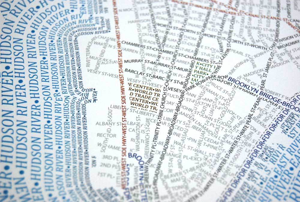


which she found on this awesome West End website.  She then painstakingly recreated each street in the neighborhood in text.


Because the neighborhood is boarded by the Park River on one side, we decided that this card needed to have more colors than just black.  The river appears in blue and local attractions are in green.

It is pretty amazing all that tiny text printed so well!  Whether you're a past or current resident, a visitor to the neighborhood, or a connoisseur of maps, this card and its bright green envelope are for you and you can buy them here!


The Full Set                                                                                                                                                                     

And finally, if you love everything you have seen here and want one of each, you are in luck because we are selling them as a set!


They come packaged together with fun bakers twine.  We love how the vibrant envelopes look stacked together!


We Hartford!  Thanks for reading!


October is RAW!


Hey party people! We’re participating in RAW’s October 4th showcase at The Russian Lady, 8pm -12am. It’s going to be an awesome party, featuring some of the raddest local artists Hartford has to offer. There will be comics, tattoos, wands, zombies, and, of course, our wild and crazy paper!
Click on our Artist’s page and purchase tickets! Come on…get silly and support us!


A second chance to see Home Is Where ♥ford Is!


If you missed the show at La Paloma, you're in luck! There is a second opportunity to see "Home Is Where Hartford Is" at Così in West Hartford Center. The work is up now and will run until May 21st. A small reception will be held on Wednesday May 12th from 3:30 to 4:30 p.m.

Open Space by Andrés

My image of the three Hartford buildings popping out of the map of Connecticut is the end of a very long process for me.

My idea started with a bedroom scene where one wall had a brick pattern with radio station call numbers in the bricks. The other wall had a pattern of flags representing the different nationalities of the residents of Hartford.

This idea changed overnight from a closed room to an open space. I went from inside to outside because the bedroom was too individual and a map is more universal. By having the map and the buildings of Hartford, the viewer can relate to the image.

In designing the three buildings, I drew them separately and then put them together by tracing them onto one piece of paper. But the three original buildings were way too big for the image size, so I had to shrink them to look like they are coming up out of the map.

I chose to print the buildings in the color blue, to represent the Connecticut flag, and the map in orange to make the image pop.

The Gold Building by Ashley

A tourist group walks around the city of Hartford on a brisk October afternoon, enjoying the beautiful architecture. Suddenly, an amazing building catches the eye of one of the tourists, just as the sun is setting behind it:

“Hey, what’s that building over there?” she inquires.

“Which one?” says the tour guide.

“The tall, shiny gold one next to that church.”

“Oh! That’s the Gold Building!”

“Wow. It’s beautiful,” says the tourist, full of awe and captured by the stunning reflections in the building.

“It certainly is,” replies the tour guide, “especially at sunset.”

Homeward Bound by Brian

The beginning of my artwork was not a sure thing- I started with only a bus. I got the idea of a bus because I was thinking about how I spend my days, how I get to school and to work. I realized that I see a lot of the city from inside the city bus. Also, I believe at some point in our lives, we all take the bus to get home.

As I got more into the project, the bus was looking lonely. Then Ms. Gale and I both came up with the idea of putting some of the popular buildings in Hartford as a skyline in the background. When I was looking at photographs of the city for inspiration, I really liked the pictures that showed Hartford with the Connecticut River, so I decided to include it in my image.

After weeks of drawing and finding the right buildings to put in my work, I was finally happy with the image and started to carve. It was not hard for me because I am good at carving. The only problem I have with carving is putting in the time. But I finished and the end result is what you see.

A Stegosaurus In Hartford by Danny

This piece took me longer to complete then I planned for. Getting my carvings to print together perfectly was very difficult because the drawing was so weirdly shaped, just like the actual sculpture. It was hard to make all three colors line up perfectly. I ended up having to carve everything twice.

Even though I initially had problems printing, I didn’t change my idea because the sculpture is very appealing to me. As a kid, the stegosaurus was my favorite dinosaur and to this day I still find it the most intriguing.

The actual sculpture is bright orange, and this is my favorite aspect. I wanted to recreate that color, as best as I could, in ink. The blue is intended to make you think about a bright sunny day, a good day.

I included the text in the image because I wanted the viewer to think about the real sculpture and its location. In addition, I think it is good to have a little humor in art!

The Heart of Hartford by India

When I first started thinking about this project, my idea was to draw the Hartford Building. I began to rethink this idea when most of my colleagues also started drawing buildings. I began to realize that for me, Hartford is not represented by the buildings but by the details of the city. I was having a hard time connecting to my drawing because it was so architectural, so linear. Ms. Gale and I talked and the idea came about to take the deer, or hart, from the Hartford Building and the stars from the Colt Building and create a scene along the Connecticut River. The boarder was made from the state flower, the mountain laurel, and leaves and acorns representing the Charter Oak tree. I chose to have a boarder to make the viewer focus more on the image. I also wanted a boarder because I enjoy more decorative art and my image looked unfinished without it.

There's No Place Like Hartford by Liz

I enjoy writing poems. Poetry is a way to express my feelings and thoughts in words. At the age of nine, I was introduced to the world of poetry and since then I have always liked the same kinds of poems. I like poems that are very descriptive and expressive but at the same time are suggestive. I only started writing my own poems at the age of ten. Most of my poems are written in Spanish, but then I later translate them into English.

When I wrote this poem about Hartford, I was thinking about my audience. I wanted to bring Hartford alive for people who have never been here. Most places have a distinct smell or sound and I wanted to express that in my poem. I also wanted to focus on the variety of cultures that we have here in Hartford.

When it came time to print my poem, I chose old-fashioned colors that you might see in an old map or manuscript. I am very attracted to things that are old or old-fashioned looking and I wanted bring that to this work. However, my drawings are really abstract and sort of modern. I liked the idea of combining the old with the new. I wanted to illustrate my words but not draw anything specifically representational. My poem mentions many senses, so the drawings are interpretations of those ideas.

Bushnell by María

When I was younger, I remember asking my mom to take me to the carousel. I would get to the park and run towards the carousel to get in line. As I waited, I watched the carousel go in circles until it was my turn.

Getting older, I found myself neglecting the carousel and park, but every now and again, I think of all the good times I had at Bushnell Park’s Carousel.

These memories inspired me to create a piece that incorporated the ride, the park, and the sense of home they once gave me.

Late Arrival! by Michelle

The reason why I decided to create something about Union Station is because ever since I was young, I have wanted to travel to different places around the world. When I think about traveling or departing, Union Station is the first thing that comes to mind because I have lived in Hartford nearly my entire life.

It took me a while to finish my piece because there were a lot of lines and details, but my work was made easier because I had help from my co-workers. :) Printing wasn’t that hard, but when I finished I realized that my clock was upside down. This mistake lead me to come up with the title Late Arrival!

I like the idea that when you think about time, or life in general, it is not something you are in control of. You can’t rewind time so why not live life to the fullest? Why not travel across the globe, socialize, have fun, laugh, and love? Have no regrets because each day is a gift and once it’s given, you never get it back.

Greetings From Hartford by Trinh

I have always been very impressed with black and white pictures and photographs. I enjoy looking at them because they are pleasing to my eyes and simply the classic of all classics. This is the reason why I steered toward such a simplistic color scheme in this project.

I started this project by sketching my hand as though it was in the middle of doing a drawing. I liked the idea of drawing a picture inside of a picture. I therefore decided to further develop this idea. I used perspective drawing to create buildings inside of what is supposed to be a postcard. Then, I later carved away the hand and the details within the postcard. This left an abundant amount of white space. The result is an extreme black contrasting with a stark white. It creates an intense but classic look. I am thrilled with the result and cannot wait for another project to come along.

Home Is Where ♥ford Is

Home Is Where ford Is
An exhibition of art by the students of Hartford Prints!

La Paloma Sabanera Coffee House
405 Capitol Avenue
Hartford, CT 06106
March 15 to April 15, 2010
Opening Reception: Thursday March 18th
from 3:30 to 6:30 p.m.

The students of Hartford Prints! were asked to think about what it means to live in Hartford. They have created nine lovely prints that showcase the city in a positive way. The art will be up on the walls from March 15th to April 15th, but please come join us for the opening on Thursday March 18th!

You can also view the event at Facebook by clicking here: Home Is Where ♥ford Is


All of the students worked hard to get these invitations printed! Special
thanks is given to Andrés for carving the background design,
Brian for carving the logo, Danny for setting the type on the front, and
María for setting the type on the back.

Press Release

"Home Is Where Hartford Is,"
An art exhibition of work by the students of Hartford Prints!
To be Held at La Paloma Sabanera Coffeehouse


The students at Hartford Prints!, a letterpress studio that employs Hartford Public High School students, are presenting their art works in a special exhibit called “Home Is Where Hartford Is.” The exhibit will take place at La Paloma Sabanera Coffee House from March 15 - April 15, 2010. La Paloma is located at 405 Capitol Avenue, Hartford. A reception will be held on Thursday, March 18, 2010 from 3:30 to 6:30 p.m. The public is invited to the reception and art will be for sale.

For this exhibit, the students were asked to create a visual representation of their view of or experience in Hartford, keeping in mind the theme of Hartford as home, in both a personal and universal perspective. The resulting images range from interpretations of the skyline of the city, to the Bushnell Park carousel, to a Calder sculpture. One student wrote a poem about walking the streets and another wished to share his experience of seeing the city via public transportation.

Hartford Prints! is the creation of Adrienne Gale and is made possible by the Hartford Arts & Heritage Jobs Grant Program, Eddie A. Perez, Mayor. Adrienne Gale is a third-generation Hartford resident and graduate of Hartford Public High School. In a recent interview for a video that is being made about the studio, Adrienne said, “Hartford Prints! is a love of Hartford from me and my students and it is an attempt to give back to the people of Hartford, the residents and the visitors.” Nine students from Hartford Public High are employed by Hartford Prints! which creates pro-Hartford printed matter and ephemera. While supported by the grant, the goal of Hartford Prints! is to donate the art to other area businesses.

La Paloma Sabanera Coffee House is hosting the art exhibit. Virginia Iacobucci, the owner of La Paloma, stated, “We are committed to supporting the arts in Hartford and this was a wonderful opportunity to showcase young talent. It also celebrates Hartford and its many wonderful characteristics. We are thrilled to work with Hartford Prints!”

♥ford

This wonderful logo was designed by my sister, the talented and amazing Aurelia Gale. For many years now, this is how our mother has been writing her return address on letters. A couple of years ago, Rory created this design for her and had it made into a rubber stamp. I have always loved the play on Hartford/Heartford.