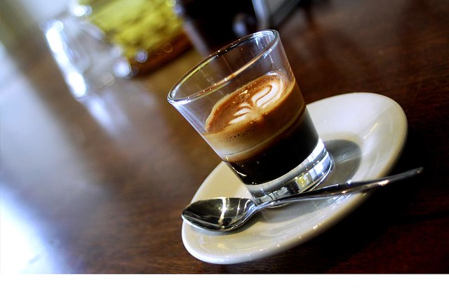
The tastes of chilled red table wine at an osteria in Puglia, the smells of incense wafting from an old Roman church, the sight of the sparkling Mediterranean as your train hugs the Cinque Terre coast, the sounds of the Tuscan dialect, lilting and romantic, and the exquisite feel of handmade Venetian lace... che bello!
Whether you are lucky enough to have a destination wedding in Italy or whether you are just looking for una cosa speciale, there are many ways to pull inspiration from this sublime place and make it your own. Each one of these design ideas would add to the sensory experience of your gorgeous day.
I Gusti...
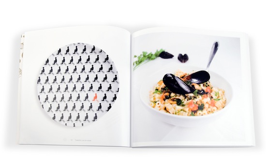
For a modern twist on traditional Italian fare, look to the new cookbook "La Puglia in un Piatto" by the Italian design firm Usopposto. Food porn for the graphically obsessed, this cookbook takes 60 traditional recipes from the Puglia region and pairs them with custom ceramics, inspired by the color and texture of the dish itself. The results are modern, sophisticated, and surprising.
 |
| Although these Usopposto plates are not for sale, look on Etsy for off-beat designed ceramics. For those creative partners on a budget, these Japanese Wasara plates and cups would be perfect to draw and design your own! |
I Profumi...
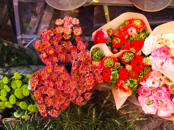
Walk through Campo de' Fiori during the daily market and the smells are a provocative combination of flowers, spices, freshly baked bread, and red wine spilt from last night's raucous party.
 |
| The bright pops of color that play off the architecture, the food, and the sunsets, would inspire anyone to go with an eclectic mix. |
 |
| This wedding in Tuscany, featured on Style Me Pretty, is both playful and traditional |
Le Viste...
There is nothing more romantic than the winding Via Dell'Amore, cut into the hillsides of Cinque Terre. Starting in the little town of Riomaggiore, it is the perfect place for guests to walk along to a sunset ceremony.
 |
| And the rusted locks left by star-crossed lovers, along with the graffiti that covers the tunnel walls, adds an urban edge to this otherwise rustic landscape. Great inspiration for an invitation suite! |
 |
| Playing off the graffiti, these letterpress prints chronicling the 2011 Tour de France from Lead Graffiti took inspiring moments from each day of the race and turned them into dynamic posters. We love the way the type speaks, and animates the concept. Great and interesting things can happen when you approach typography a little backwards. |
I Suoni...
Language and wording are so important, whether printed or spoken, since it is how your story is told. Incorporating two languages into a wedding can seem daunting, but it can be done with charm, wit, and originality.
 |
| The layout and font of these Italian street signs would work perfectly as a menu or program, with the translation of each item underneath instead of a telephone number. |
 |
| This invitation suite, from Lion in the Sun, does a beautiful job of incorporating two languages while creating a cohesive composition. |
 |
| Sometimes the best solution is to do away with type altogether, like this silkscreen map of Rome by These Are Things, letting the images speak for themselves. |
Il Tatto...
Italy is perhaps best known for its fashion and luxurious textiles. From Venetian lace to Lombardian silks, Italians take their cloth very seriously and there are interesting ways to bring texture and layers to any printed matter.
 |
| Playing off the bohemian chic of this vintage-inspired dress by Delphine Manivet, lace can be a recurring theme carried through to all your paper goods. |
 |
| From Flourish Letterpress, the designer used laser engraving techniques to create lace out of paper that incorporates the couple's initials. |
 |
| Simple, yet sophisticated, from the lovely Blackbird Letterpress |
 |
| The mustard yellow envelopes lined with vintage 1930s wallpaper give depth and intrigue to this invitation suite by Allie Ruth Design |
Alla prossima...Ciao!


No comments:
Post a Comment